
How Clinics Can Use Android AR Anatomy in a 7-Minute Consultation
Most anatomy explanations in clinic fail for a simple reason: the patient cannot picture what the clinician is describing quickly enough. The doctor knows exactly where the tendon tracks, where the disc sits, or why the joint movement hurts. The patient hears the words, tries to follow, and often leaves with a blur of labels rather than a clear mental image.
That problem gets worse when the visit is short. In a seven-minute consultation, there is barely enough time to assess, explain, confirm understanding, and move toward next steps. If the anatomy explanation stays abstract, the clinician either rushes it or overexplains it. Neither option helps much.
Short consultations usually break at the visualization step
When patients do not understand the structure, they often do not understand the recommendation either. They may nod politely, but they leave unsure what was injured, what is inflamed, or why a movement change matters. That is not always a knowledge problem on the doctor's side. It is often a translation problem between clinical anatomy and patient understanding.
This is also why a clinic-friendly anatomy visual tool must stay disciplined. It should clarify one structure or relationship at a time. If it becomes a complicated display, it adds friction instead of removing it.

A practical seven-minute anatomy explanation workflow
A useful workflow can fit into a normal consultation:
- Start with the patient's own description of pain, limitation, or concern. 2. Show the relevant body area in a simplified spatial view. 3. Isolate only the layer or structure that matters for the explanation. 4. Explain the relationship in plain language. 5. Ask the patient to describe back what they understood.
That sequence matters because it keeps the visual tied to the patient's concern instead of turning the encounter into a mini lecture. The tool is supporting the communication, not becoming the main event.
For clinics, the challenge is practical. The visual needs to be fast, mobile, and easy to use on a familiar device. If it demands a whole new setup, the workflow breaks. That is why Android-friendly anatomy support is so relevant: it reduces the gap between “this would help” and “we can actually do this in a real room today.”
The hidden risk is showing too much anatomy at once
Many clinicians already know that visuals help. The more subtle mistake is overloading the patient. Once a full anatomy model is visible, the temptation is to explain more and more structures. The patient, meanwhile, usually needs one focused story: what hurts, what moves, and why the recommendation follows from that explanation.
That is where layer control matters. A visual explanation works best when superficial detail can fall away and the relevant structure becomes easy to isolate. If the patient only needs to understand the relationship between one tendon and one motion, the explanation should stay there. Precision is often more humane than completeness.
The earlier MeduTechs article on how clinics use a 3D anatomy app for patient education is a good companion if you want the broader patient-education case. This article is narrower on purpose: it focuses on the short-consultation workflow where time pressure is the main constraint.
Where this becomes practical with MeduTechs
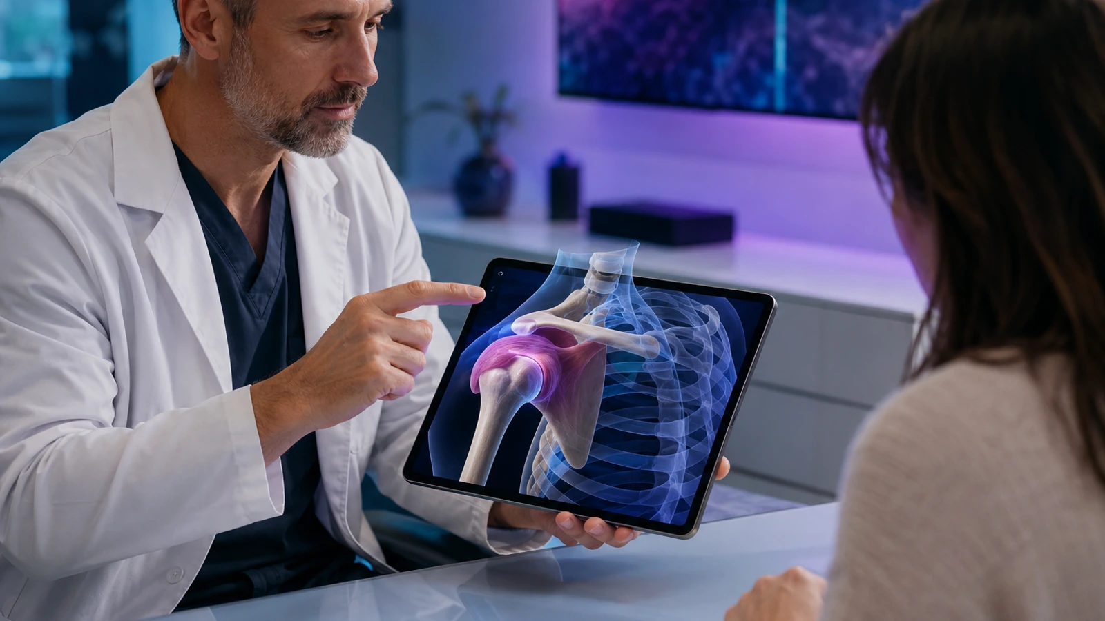
This is where MeduTechs becomes concrete. MeduTechs is the company behind a 3D anatomy learning platform, and in the clinic workflow the relevant app is the Mobile App. The primary feature is AR Anatomy on Android. In plain language, that means a clinician can place a spatial anatomy view into the conversation on a familiar device rather than forcing the patient to translate everything from verbal description alone.
The feature becomes especially useful when the explanation depends on location and depth. A patient can more easily understand what is being discussed when the structure is shown in a physical context rather than described only with directional language. Supporting tools like Hide-Unhide and the Description panel help the clinician simplify the explanation instead of crowding it. That matters because the goal is clarity, not spectacle.
The point is not to turn the consultation into a technology demo. The point is to make one difficult explanation easier to understand. That is where the feature earns its place in a real workflow.
Doctors who want the adjacent physician perspective can also read how doctors use anatomy visuals for better patient understanding, which is helpful when the challenge is less about clinic operations and more about communication style.
A common mistake is using the visual before the patient problem is clear
Another hidden risk is introducing the tool too early. If the clinician reaches for the visual before the patient's concern is fully framed, the explanation can feel generic or even distracting. The stronger order is to listen first, identify the decision point, and then use the visual when it solves a specific comprehension problem.
What clinics should do next
That is the right way to assess MeduTechs too. The question is not whether AR looks interesting. It is whether MeduTechs Mobile App and its AR Anatomy feature make a specific patient conversation easier to understand inside the real pace of clinic work. For teams that want a cleaner explanation workflow without a heavier setup, that is the useful conversation to have next: explore MeduTechs for clinics.
The MeduTechs for Clinics hub is also worth keeping nearby if you want related examples of anatomy explanation workflows, patient education patterns, and doctor-friendly use cases.

What clinics should measure after trying this workflow
It is also worth watching whether the workflow stays lightweight. If opening the anatomy view feels awkward or disrupts room flow, the team will abandon it quickly. If it fits naturally into the consultation, even for one or two recurring use cases, then the feature is solving a real communication bottleneck rather than creating one. That is the threshold a clinic should care about before scaling the habit more widely.
What strong early use should look like
The first month with Mobile App should not be judged only by excitement. b2b clinics android app readers need a workflow that becomes easier to repeat after the first strong session, not harder. That is the simplest sign that the article's recommendation is grounded in real use rather than one impressive moment.
In practice, that means watching whether AR Anatomy (Android) removes one clear bottleneck in the routine described above. If the bottleneck stays fuzzy, the workflow is still too broad. If the bottleneck becomes easier to name, easier to solve, and easier to revisit, then the tool is starting to fit the reader's real environment. That is the outcome that matters for b2b clinics android app.
It is also worth checking whether the next action becomes more obvious. Strong product fit usually reduces indecision. The learner, faculty member, clinician, partner, or administrator should finish the first cycle knowing what to repeat, what to adjust, and where Mobile App should sit in the workflow next time. When that happens, the feature is no longer just interesting. It is becoming operationally useful.