
Make The Anatomy Explanation Smaller
Patient education works better when the clinician shows one structure, one relationship, and one next step.
The Short Answer
This article is about MeduTechs Mobile Anatomy App and its patient-friendly view feature. In plain language, a Mobile Anatomy App feature that helps clinicians simplify the visual explanation so patients see the relevant structure without being overwhelmed by the full model. The point is not to mention a MeduTechs product and then move on. The point is to show exactly where the product helps the reader make a better decision, teach a clearer lesson, explain anatomy more safely, or study with less drift.
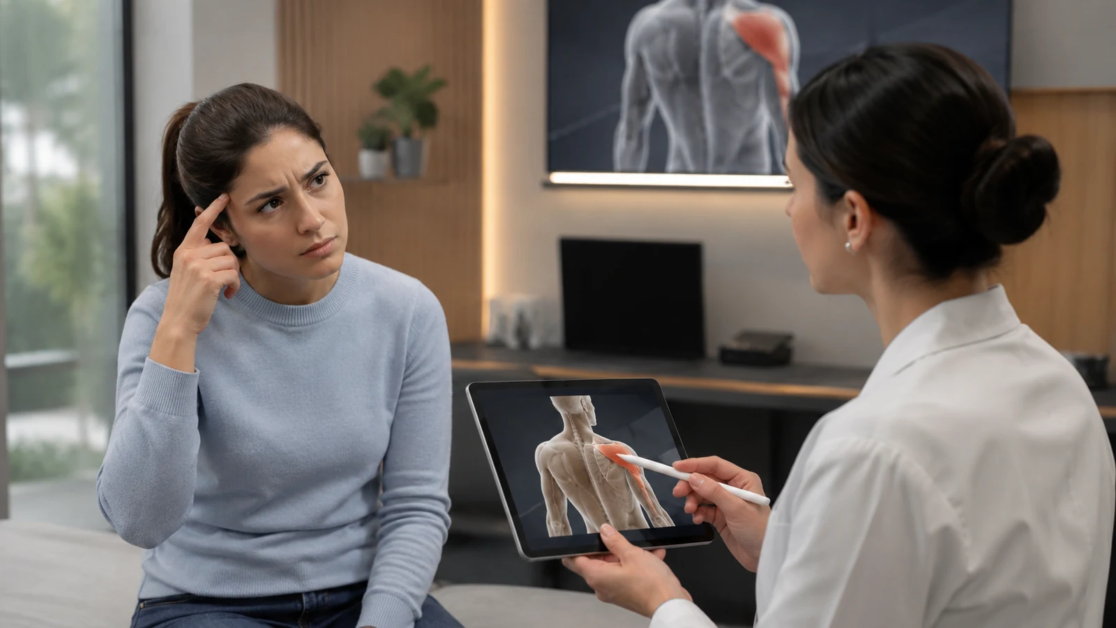
The patient needs clarity, but the full anatomy model can become too much if the clinician shows everything at once. That is the real problem. Clinics need tools that fit short visits and help patients understand without turning the appointment into a lecture. So the article starts with the workflow, names the MeduTechs app clearly, and keeps the explanation practical.
The Real Problem
A clinic owner or specialist explaining anatomy during a short visit does not need a vague promise about AI, VR, or anatomy learning. They need one thing to work better this week. The patient needs clarity, but the full anatomy model can become too much if the clinician shows everything at once. If the tool cannot help at that exact moment, the article should not pretend otherwise.
The related MeduTechs audience page, MeduTechs for Clinics, belongs here because it gives the reader a broader path for this audience instead of dropping a promotional link at the end.
The Common Mistake
Showing more anatomy when the patient actually needs a smaller, clearer visual anchor. This mistake is easy to make because the first version often looks helpful. More information feels safer. A longer answer feels smarter. A bigger model feels more complete. But the reader usually needs less noise and a clearer next step.
That is why the article keeps returning to one app and one feature: MeduTechs Mobile Anatomy App and patient-friendly view. The reader should not have to guess whether MeduTechs means MeduTechs Mobile Anatomy App, MeduTechs VR Anatomy App, Quiz Maker (MAIQ), MeduTechs University Panel, or MeduTechs Professor Tools.
A Simple Framework
Use this five-part check: Choose one structure, Hide the noise, Explain the relation, Check understanding, Give the next step. The framework is intentionally plain. It gives the reader a way to act without needing to buy into a grand theory of medical edtech.
A previously published MeduTechs article, The Five-Minute Anatomy Explanation Problem, is useful at this point because it shows the adjacent problem from the last cycle. This new article moves the idea forward instead of repeating the same angle.

Where MeduTechs Becomes Practical
Here is the practical connection: MeduTechs Mobile Anatomy App is the MeduTechs product in focus, and patient-friendly view is the feature doing the work. a Mobile Anatomy App feature that helps clinicians simplify the visual explanation so patients see the relevant structure without being overwhelmed by the full model. For clinics and medical specialists, that matters because the feature supports a real behavior, not a loose product claim.
The soft next step is simple: if this workflow fits the reader’s problem, Explore MeduTechs for clinics. That link is placed here because the article has already explained the problem and the feature, not because every section needs a sales moment.
What Good Use Looks Like
Good use is small enough to repeat. The reader starts with one question, one structure, one policy rule, one reasoning step, or one debrief moment. Then the tool helps make that moment visible. If the workflow becomes easier to explain, review, or repeat, the product is doing useful work.
Bad use is the opposite. The tool gets bigger while the decision gets blurrier. The user sees more anatomy, more AI output, or more interface, but the next action is still unclear. That is what this article is trying to prevent.
A Real-World Example
Picture the reader using this on an ordinary day, not in a perfect demo. A clinic owner or specialist explaining anatomy during a short visit has limited time and a real task in front of them. They are not asking for every MeduTechs capability. They are asking whether MeduTechs Mobile Anatomy App can help with this one workflow without making the situation harder to manage.
That is where patient-friendly view earns its place. The feature should make the next action easier to see. For a school, that may mean a rule students can follow. For a professor, it may mean a better question. For a clinic or doctor, it may mean one clear anatomy explanation. For MAIQ, it may mean one reasoning error turned into tomorrow's review plan. For a partner, it may mean a debrief that faculty can actually use.
The Hidden Risk
The hidden risk is not only that the tool fails. It is that the tool appears helpful while quietly moving the reader away from the real task. A student may feel productive while avoiding recall. A professor may accept a long answer without checking the question. A doctor may show a beautiful model while the patient misses the point. A partner may run an immersive station but lose the teachable moment during debrief.
This is why the article names MeduTechs Mobile Anatomy App and patient-friendly view early. When the product is named clearly, the reader can judge the actual promise. They can see whether MeduTechs is talking about University Panel, Professor Tools, the Mobile Anatomy App, Quiz Maker (MAIQ), or the VR Anatomy App. That clarity matters because each product solves a different job.
How To Keep It Human
The easiest way to make medical edtech sound artificial is to describe everything as a system, a platform, or a transformation. The reader does not live inside those words. They live inside a class, a clinic, a study session, a pilot meeting, an exam block, or a simulation lab. So the article should stay close to those moments.
Use simple verbs: choose, show, ask, check, explain, review, repeat. Those verbs are practical. They make the MeduTechs feature easier to understand and easier to trust. If patient-friendly view cannot be explained through those verbs, the article should slow down and make the workflow clearer before asking the reader to take action.
What Success Looks Like
Success is not a dramatic claim. It is a reader who knows what to do next. The investor knows which diligence question to ask. The university leader knows how to write a student-facing rule. The professor knows how to reshape a weak prompt. The clinician knows how to make the anatomy explanation smaller. The student knows how to connect structures into a system. The exam candidate knows why a miss happened.
That is a more honest standard for MeduTechs content. It lets the product be visible without turning the article into a hard sell. It also gives the next workflow a chance to be measured, improved, and repeated.
The Plain-Language Check
Before the reader trusts the article, they should be able to say the product sentence back in simple words: this is MeduTechs Mobile Anatomy App, and the feature is patient-friendly view. It helps by making one part of the workflow easier to control, explain, review, or repeat. If that sentence is not clear, the article is not clear enough yet.
This also protects the MeduTechs brand. The article should not hide behind vague product labels or loose AI language. It should name the product, explain the feature, and then show why that feature matters in a real situation. That is more direct, more human, and easier for a reader to remember.
The Decision Point
The decision point is deliberately small: should the reader try this MeduTechs feature in one real workflow? For this article, the answer depends on whether patient-friendly view makes the next step clearer than the current habit. If it does, the feature has earned attention. If it does not, the reader should keep the workflow narrow and improve the setup before scaling anything.
What To Do Next
The next step is not to add every MeduTechs feature to the article. The next step is to test whether patient-friendly view helps the reader do the specific job described here. If yes, the workflow can become part of a pilot, study routine, clinic explanation, exam review, or simulation debrief.
The related article 3D Anatomy for Clinics When Explanation Time Is Tight is a useful continuation because it connects this week’s sharper feature angle to an existing MeduTechs topic without repeating it.

Sources And Further Reading
- Bridging the AI Policy Gap in Medical Education - Responsible Use of AI in and for Medical Education - AACOM AI Foundations: Responsible Use of AI in Medical Education - Medical Students' Experiences With Virtual Reality Simulation Training
The Takeaway
The memorable insight is simple: medical education tools should make the next human action clearer. MeduTechs Mobile Anatomy App and patient-friendly view should help the reader teach, study, explain, review, or decide with less confusion.
That is the standard for this week’s MeduTechs content: direct, useful, product-clear, and easy to follow. The reader should leave knowing the product, the feature, the problem, and the next practical step. That clarity is the point, always, especially before publishing the article.
Continue reading
Frequently asked questions
References
- Bridging the AI Policy Gap in Medical EducationTrust A- Medical schools vary in how specifically their AI policies address medical students, coursework, assessment, research, and clinical documentation.
- Responsible Use of AI in and for Medical EducationTrust A- Responsible AI use in medical education should remain human-centered and preserve educator and learner judgment.
- AI Foundations: Responsible Use of AI in Medical EducationTrust A- Medical educators need judgment, ethical practice, and safe integration when using AI across academic and clinical learning contexts.
- Medical Students' Experiences With Virtual Reality Simulation TrainingTrust A- VR medical simulation can support immersive learning contexts, including anatomical model exploration, when used with appropriate educational design.