
How Clinics Can Explain Anatomy Faster Without Losing Patient Trust
In a busy clinic, patient understanding often breaks down at the exact moment the explanation matters most.
You have limited time. The patient is anxious. The condition involves a structure they cannot picture. You can feel the gap forming while you speak: too much jargon and they disengage, too much simplification and they leave with the wrong mental model.
That is why visual anatomy support is becoming a practical clinic workflow question, not a marketing extra. The goal is not to make the consultation flashy. The goal is to make the explanation clear enough that the patient can follow what is wrong, what happens next, and why the plan makes sense.
Why this matters more now
The American Medical Association's May 20, 2026 patient-AI guidance makes an important point: patients are already using AI tools to prepare for appointments and decode medical language, but those tools should supplement, not replace, physician expertise. At the same time, the AMA's 2026 physician AI survey reflects growing attention to patient-facing AI use and training-related workflows.
That means clinics are entering a new communication environment. Patients arrive with questions shaped by the internet, by chatbots, and by partial understanding. The explanation workflow inside the visit has to do more work than before.
The communication problem is usually spatial
Many patient conversations fail because the physician is explaining a three-dimensional problem with two-dimensional language.
This happens in orthopedics, ENT, cardiology, general surgery, dental and maxillofacial settings, sports medicine, and many chronic-pain visits. The patient hears the name of a structure but cannot map it to the body they experience every day.
When that mapping is weak, the follow-on problems are predictable:
- poor recall after the visit - low confidence in the treatment plan - repetitive follow-up questions - weak teach-back when a family member asks what the doctor said
Visual health-literacy research supports the common-sense version of this. Patients often understand health material better when visual aids are used well. The lesson for clinics is not "replace conversation with a screen." It is "pair explanation with a visual that reduces ambiguity."

What a strong clinic explanation workflow looks like
A good anatomy explanation in clinic usually has four moves.
1. Name the structure in plain language
Start with where the problem is and what part of the body is involved.
2. Show the relationship
Patients understand faster when they can see what sits above, below, behind, or around the painful or injured area.
3. Connect the structure to the symptom
The explanation becomes real when the patient understands why that structure creates the pain, numbness, weakness, or limitation they feel.
4. Check understanding
Ask the patient to say it back in simple terms. This is where many explanations reveal whether they actually worked.
That workflow is fast, but only if the visual is clean. Crowded educational images, generic online diagrams, or fake app screenshots usually slow things down rather than helping.
The hidden mistake many clinics make
The mistake is thinking that any visual is automatically useful.
A cluttered diagram with tiny labels can be worse than no visual at all. So can a broad educational animation that is not tied to the patient's actual question. The goal is not to impress. The goal is to reduce cognitive load inside a time-limited conversation.
Another mistake is using AI-generated explanations in front of patients as though the chatbot itself were the authority. The AMA guidance is helpful here: AI can support understanding, but physician judgment remains central. In clinic, that means the visual should serve the conversation the clinician is already leading.
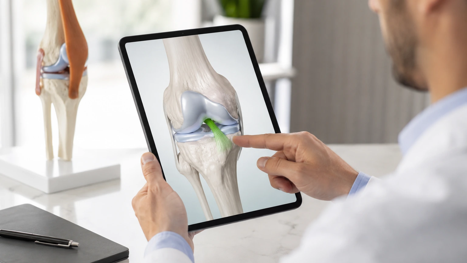
Where a mobile anatomy workflow becomes practical
This is where a focused mobile tool matters. A clinic does not need a giant teaching platform in the exam room. It needs a fast, clean way to isolate the right structure, show the relationship, and speak to the patient in terms they can follow.
The most relevant MeduTechs feature here is the Description Panel inside the Mobile App. The practical value is that the clinician can keep the explanation anchored to one structure and its nearby anatomy instead of jumping between unrelated visuals or generic search results. Supporting features like part isolation help because they reduce clutter rather than adding it.
For clinics exploring that broader communication angle, MeduTechs' clinic anatomy explanation articles are the right internal next step.
A practical five-minute use case
Imagine a patient with shoulder impingement symptoms.
In a rushed explanation, the doctor may say the tendon is irritated under a bony arch and recommend physical therapy. The patient nods politely and leaves unsure what that means.
In a clearer workflow, the doctor:
- isolates the shoulder region 2. shows the tendon and the surrounding bony space 3. points to where motion creates friction 4. connects the structure to the pain during overhead movement 5. asks the patient to explain back what is being pinched and why therapy is meant to help
That sequence is short, but it changes the quality of the conversation.
What clinics should measure
If a practice wants to know whether a visual anatomy workflow is worth keeping, measure operational signals that matter:
- fewer repeated clarification questions - faster patient understanding during common explanations - stronger teach-back - better confidence when discussing treatment choices or next steps
The goal is not to claim a grand clinical outcome that the clinic cannot prove. The goal is to see whether communication gets clearer, faster, and more repeatable.
A teach-back script clinics can borrow
The teach-back moment does not need to sound formal. A clinician can simply ask:
- "Can you show me where the problem is in your own words?" - "What is the structure doing that causes the pain?" - "Why are we starting with this plan instead of the other option?"
Those questions work because they reveal whether the explanation was structural or merely verbal.
Which visits benefit most
This workflow is especially helpful in repeat-heavy explanation visits: joint pain, nerve compression, sinus pathways, TMJ complaints, tendon irritation, and many post-imaging discussions.
It can also improve referral transitions. When patients understand the structural story better, they tend to describe the problem more accurately to physical therapists, family members, and follow-up clinicians, which reduces the communication reset that often happens after the visit ends.
That matters operationally because a clearer first explanation can save time outside the room too, not just inside it.

What to do next
Pick one high-frequency explanation in your clinic this month: rotator cuff pain, lumbar nerve irritation, sinus anatomy, TMJ, or another common case. Build one structured visual explanation around it and test whether patients can describe the issue back more clearly after the visit.
That small workflow test will tell you more than any abstract conversation about digital health innovation.
If the answer improves even for one common visit type, the clinic has found a reusable communication asset. That is usually how adoption should begin: one explanation, one repeatable workflow, one measurable improvement in patient understanding.
From there, the clinic can decide whether the next best use case is another explanation type, a referral-support workflow, or a patient handoff moment after imaging. The important thing is that expansion follows a proven communication gain.
Sources and further reading
- The effectiveness of visual-based interventions on health literacy in health care: a systematic review and meta-analysis - New AMA infographic helps patients safely navigate AI in healthcare - AMA Augmented Intelligence Research: 2026 Physician Survey